The term brand gets used a lot. Brand values is something that the vast majority of employees will hear at some point in their career and often times it won’t really mean anything beyond a list of promises to the customer.
Brand itself, however, forms part of a company’s identity. It communicates something about the organisation without the need for florid prose so it’s really important to get it right when either creating your brand for the first time or rebranding an established company.
What is a brand?
Marketers define brand as a name, symbol or design used to identify a company’s products or services. In other worlds it represents everything the company is or does.
The Apple logo, for example, conjures images of the iPhone, iPad and brushed steel laptops.
Great brands, however, aren’t just about design; colour plays a major part. That’s not to say that Apple, Microsoft or Facebook wouldn’t have enjoyed the success they had if their logos had been coloured in neon shades of pink, yellow and green but the psychology of colour suggests that they perhaps might not have been as successful as quickly.
What is the psychology of colour?
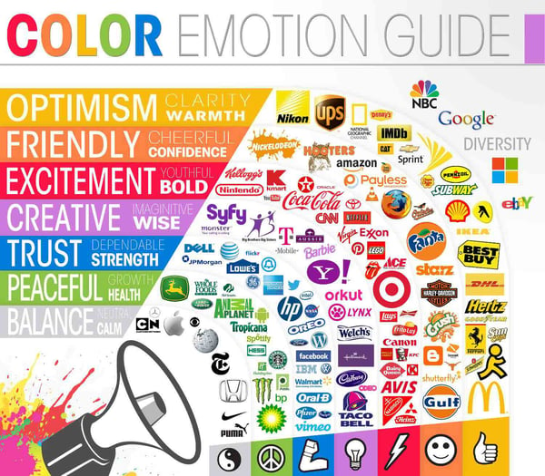
Simply put, we associate colours with different feelings or emotions. The obvious example is red. Red is associated with youthfulness, energy and excitement. Some of the most recognised brands in the world are red – Coca Cola, Lego, Virgin and Netflix to name a few.
Equally it’s no coincidence that Ford and Volkswagen use predominantly blue logos as they want to be synonymous with trust, strength and dependency.
Understanding your business, its objectives and the emotions you want to draw on will give you a steer on the core colour palette you should be choosing from. Get it wrong and your brand simply will not sit right with your ambitions or your customers.
Which Colour is Best?
Whilst we can advise you, ultimately the answer is: whichever colour you like the best. You have to be happy with the colours you have chosen for your business as you’ll be stuck with them for a long time.
Do remember, however, that colour association is something we all share so it is a hard thing to ignore. So whilst it shouldn’t dictate your decision it should be at the very least, a consideration.
There’s also a temptation to try and be all things to all people and use multiple core colours. Microsoft and eBay get away with it because they really are all things to all people.
Colour associations allow you to really hone in on what your company is best at, what they’re about and what they stand for (if anything). If you don’t know, now is the time to figure that out.
Colours can also communicate notions of value, quality or accessibility. Rich blues, golds and deep reds all suggest luxury and expense. Silver is rooted in technology and innovation which has a less overt message of cost but instead emphasises a need over a want or indulgence.
Identify key words that sum up the values or company goals (creativity, knowledge, reliability) most important to you then use something like the example given below to identify a core brand colour.
Choosing your core colour is only part of the process, however. Knowing which colours work and which colours do not will make the difference between a great looking brand and a mess.
Our commitment to understanding your unique needs ensures that prints we deliver not only meet but exceed your expectations, leaving a lasting impression on your audience.
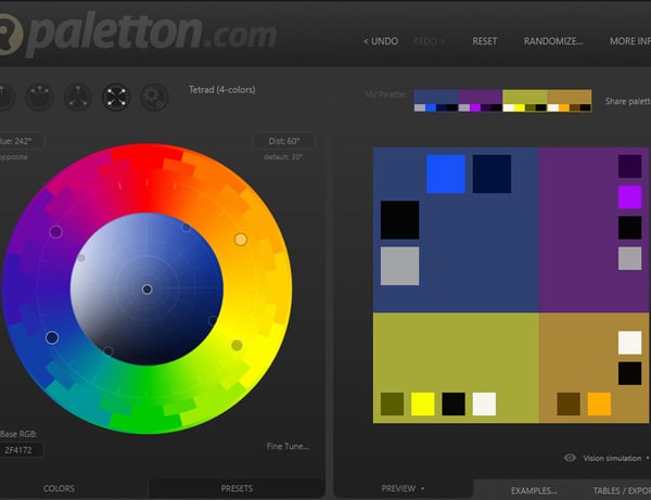
Colour scheme tools, like Paletton, are available that can assist you in devising a series of complimenting accent colours. This will quickly and easily give a palette of colours that work with your core colour.
This will all go a long way to giving you a brand that feels right as well as looks right too.
As with any part of business development, the important thing is to test the colours out, ask opinions and make adjustments. Whilst tools like Paletton are great, they aren't gospel. You can choose to ignore them.
Evans Graphics operates a dedicated and highly skilled team of designers capable of assisting you in the creation of your brand and any associated materials.
