Grand Unification Theory is an attempt to explain how the universe works. How everything ties together and ‘makes sense’.
Our unification theory is a little less intergalactic and doesn’t concern itself quite so much with humanity’s place in the universe as it does you and your business and how your design all ties together.
We are, of course, talking about brand.
A good brand is like wine. The good ones get better with age. The great ones are indescribable.
The biggest companies in the world have done very little to their brands over the years. There has been the odd modification here and there but rarely do big players reinvent themselves because of the value those distinctive logos or icons represent.
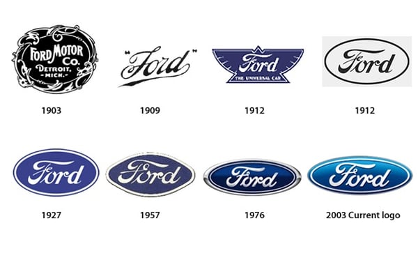
Just 6 years after founding, the Ford Motor Company changed their logo to Henry Ford's distinctive signature and it has remained as the motor company's iconic logo ever since.
Those businesses understand the value of creating a uniform (or unified) brand that looks and feels consistent whether it’s on a brochure, a banner or a billboard.
Crooked diesel engines aside, Volkswagen is one of our favourite companies for their unrelenting attention to detail. Everything they do looks, feels and sounds…Volkswagen.
The two ads were printed 70 years apart. Other than a bit of copy, nothing has really changed.
The tag lines are cheeky, self-deprecating and work with the imagery to hold your focus where they want it: on the car.
Even the VW roundel is always on the right side at the bottom of the ad.
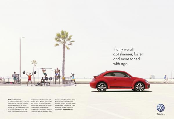
Even the roundel itself, whilst a little prettier, is essentially unchanged.
Volkswagen recognised, as did Ford, Coca-Cola, more recently Apple (along with a raft of others), that producing something that looks quintessentially ‘you’ means your audience can focus on what you’re communicating rather than identifying who you are.
So what does this mean for you and your business?
Simply put, look at what the big boys are doing and do that. It doesn’t matter how big (or small) your business is, everything from your business cards to your exterior signage should look and feel…you.
You don’t need big budgets, a big product or even a particularly big idea. Just an idea of how you want things to look and stick to it.
Whether you’re selling services or products, anything that isn’t a photo should be consistent.
Creating guidelines of how everything from fonts and font colours to logo usage should be used will make it far easier for you to establish a professional looking brand.
It also makes it far easier to design collateral because a lot of the hard work has been done.
There is no uncertainty surrounding how you want your business to be presented which makes for a quicker, easier process which can make it a cheaper one too.
This turns producing signage, display stands, or any other branded materials, into a straight forward design process, focused on the message rather than where you want the logo to sit or what colour the font should be.
Because that work has already been done for you.
Again, look at Volkswagen.
There is only ever one roundel, always a set number of millimetres from the bottom right corner. They always use the same fonts – and have done for 70+ years – and always in the same colours.
Very unified, very consistent, very Volkswagen.
